
Understanding Cultural Differences

Cultural differences play a crucial role in effective website navigation for international audiences. We must consider various aspects to create an inclusive and user-friendly experience across cultures.
Identifying Cultural Nuances
Cultural nuances encompass symbols, colors, and imagery that hold different meanings across cultures. Red may signify luck in China but danger in Western countries. We should carefully select visual elements to avoid unintended negative connotations.
Icons and symbols can also vary in interpretation. A thumbs-up gesture is positive in many Western cultures but offensive in some Middle Eastern countries. It’s essential to use universally understood icons or provide clear explanations.
Cultural preferences in layout and design should be considered. Some cultures prefer text-heavy sites, while others respond better to visual content. We must strike a balance to cater to diverse preferences.
Adapting to Language Variations
Language adaptation goes beyond simple translation. We need to consider:
- Idiomatic expressions: Literal translations may not convey the intended meaning.
- Date and time formats: Use appropriate formats for different regions (MM/DD/YYYY vs. DD/MM/YYYY).
- Units of measurement: Offer both metric and imperial units when relevant.
Text expansion in translation can affect layout. We should design flexible layouts to accommodate languages that require more space, such as German or Russian.
Providing language options is crucial. Use easily recognizable flags or language names for selection. Consider offering region-specific dialects for major languages like Spanish or Chinese.
Considering Local Internet Practices
Internet speeds and accessibility vary globally. We must optimize our site for diverse conditions:
- Create lightweight versions for areas with slower connections
- Implement progressive loading techniques
- Offer offline functionality where possible
Mobile usage differs across regions. In some countries, mobile is the primary means of internet access. We should prioritize mobile-responsive design and touch-friendly navigation.
Local search engines and social media platforms may be preferred over global ones in certain countries. We should optimize for these platforms and include relevant local sharing options to improve visibility and user engagement.
Designing for Accessibility

Accessible web design ensures all users can navigate and interact with your site, regardless of abilities or disabilities. By implementing key accessibility features, we create an inclusive experience that benefits international audiences and improves usability for everyone.
Implementing ARIA Landmarks
ARIA landmarks provide a way to define the structure and purpose of different areas on a web page. We use roles like “navigation”, “main”, and “search” to clearly identify page regions. This helps screen reader users quickly understand and navigate the layout.
Some key ARIA landmarks to implement:
- role=”banner” for the site header
- role=”navigation” for menus
- role=”main” for the primary content
- role=”complementary” for sidebars
- role=”contentinfo” for the footer
We also use aria-label attributes to provide descriptive names for landmarks when needed. This creates a clear page outline for assistive technologies.
Ensuring Keyboard Navigability
Keyboard navigation is essential for users who can’t use a mouse. We ensure all interactive elements are focusable and operable using only a keyboard.
Key considerations include:
- Logical tab order following visual layout
- Visible focus indicators
- Skip links to bypass repetitive content
- Dropdown menus navigable via arrow keys
- Modal dialogs that trap focus appropriately
We test extensively using only a keyboard to identify and fix any barriers. Proper keyboard support benefits many users, including those with motor impairments or using mobile devices.
Providing Alt Text for Images
Descriptive alt text allows users who can’t see images to understand their content and purpose. We write concise, meaningful alt text for all informative images.
Best practices:
- Be specific and succinct (aim for <125 characters)
- Describe the image’s content and function
- Don’t use “image of” or “picture of”
- Leave alt blank for decorative images
For complex images like charts or infographics, we provide longer descriptions using aria-describedby or figure/figcaption. Proper alt text improves SEO and benefits all users in low-bandwidth situations.
Creating a Responsive Layout
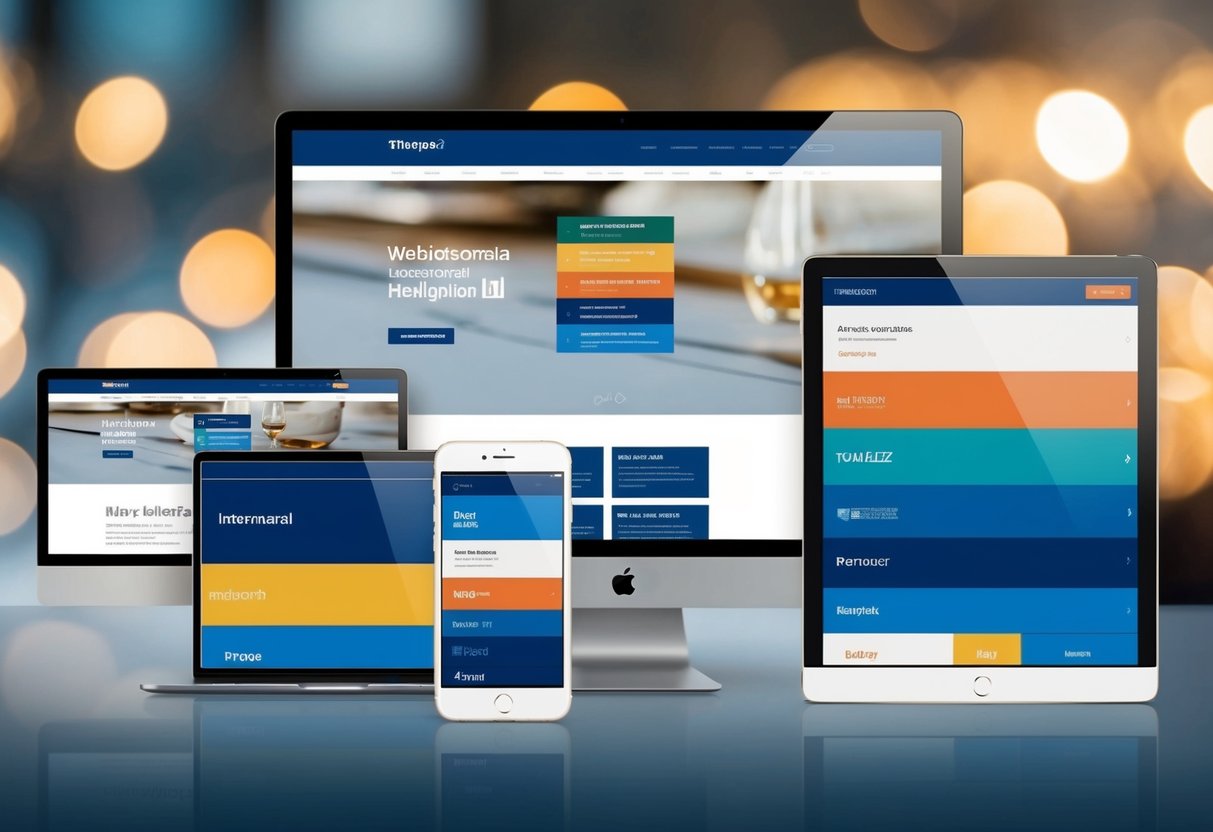
A responsive layout is crucial for accommodating diverse international audiences accessing your site from various devices. We’ll explore key strategies to ensure your website adapts seamlessly across different screen sizes and orientations.
Mobile-First Approach
We start by designing for mobile devices first. This approach prioritizes essential content and functionality for smaller screens. We focus on a single-column layout, larger touch targets, and simplified navigation menus. As screen sizes increase, we progressively enhance the design with additional features and content.
Mobile-first design ensures a solid foundation for all users, regardless of their device. It also helps improve page load times, which is especially important for regions with slower internet connections.
Flexible Grid Systems
We implement flexible grid systems to create layouts that automatically adjust to different screen sizes. These grids use relative units like percentages instead of fixed pixels. This allows content to fluidly resize and reposition as the viewport changes.
We typically use a 12-column grid system for versatility. It provides numerous options for organizing content while maintaining consistency across breakpoints. For example:
Desktop: [   Content   ][  Sidebar  ]
Tablet:  [   Content   ]
         [  Sidebar  ]
Mobile:  [ Content ]
         [ Sidebar ]
Media Queries for Different Devices
Media queries allow us to apply specific CSS rules based on device characteristics. We use them to adjust layouts, typography, and other design elements for optimal viewing across various screen sizes.
Common breakpoints include:
- Mobile: up to 767px
- Tablet: 768px to 1023px
- Desktop: 1024px and above
We also consider device orientation, pixel density, and other factors. For example:
@media (max-width: 767px) {
  .menu { display: none; }
  .mobile-menu { display: block; }
}
This code hides the standard menu and displays a mobile-friendly version on smaller screens.
Streamlining Site Structure

A well-organized site structure is crucial for international audiences to easily navigate and find relevant content. We’ll explore key strategies to optimize your website’s architecture for global users.
Simplifying Navigation Menus
Navigation menus are the primary way users explore a website. We recommend limiting top-level menu items to 5-7 options. This prevents overwhelming visitors and improves usability across cultures.
Group related pages under clear, descriptive categories. Use universal icons alongside text labels when possible. This aids comprehension for non-native speakers.
Consider implementing a mega menu for sites with extensive content. This allows users to see more options at once without cluttering the main navigation.
Test menu labels with native speakers from target markets. Words that make sense in one language may be confusing in another.
Optimizing Page Hierarchy
A logical page hierarchy helps users understand how information is organized. We suggest using a shallow, wide structure rather than deep nesting.
Limit your site to 3-4 levels deep. This reduces the number of clicks needed to reach important pages.
Create clear parent-child relationships between pages. Use descriptive URLs that reflect this hierarchy, like example.com/products/category/item.
Implement a consistent internal linking strategy. Link related pages to each other to create a cohesive user experience.
Consider cultural differences when structuring content. Topics that are grouped together in one culture may need separate categories in another.
Enhancing Breadcrumbs
Breadcrumbs provide context and allow users to easily navigate back to higher-level pages. We recommend using location-based breadcrumbs for most international sites.
Display the full path from the homepage to the current page. Use > or / as separators between levels.
Make each level clickable to allow quick navigation. Include the current page in the breadcrumb trail, but don’t link it.
Translate breadcrumb labels for each language version of your site. Ensure translations accurately reflect the page hierarchy.
Consider using schema markup for breadcrumbs. This helps search engines understand your site structure and may improve rich snippets in search results.
Implementing Multilingual Support

Effective multilingual support is crucial for engaging international audiences. We’ll explore key strategies for language selection, content localization, and leveraging automated translation tools.
Language Selection Features
Language selection should be intuitive and easily accessible. We recommend placing language options in the header or footer of your site. A dropdown menu or flag icons are common approaches. Consider using geolocation to automatically detect a user’s location and suggest the appropriate language.
For mobile users, a separate language menu can improve usability. It’s important to display language names in their native form (e.g. Deutsch instead of German) to enhance recognition.
We also suggest remembering user language preferences through cookies or account settings. This eliminates the need for repeated selection on return visits.
Content Localization Strategies
Content localization goes beyond simple translation. We need to adapt content to reflect cultural nuances and preferences. This includes adjusting images, colors, and symbols to resonate with local audiences.
Date formats, currencies, and units of measurement should align with regional standards. For e-commerce sites, product descriptions and pricing must be localized.
We recommend creating separate content calendars for each language to address region-specific events or holidays. User-generated content, like reviews or comments, should ideally be displayed in the user’s chosen language.
Localized URLs (e.g. example.com/de/ for German) can improve SEO and user experience.
Automated Translation Tools
While professional translation is ideal, automated tools can be useful for large-scale content or frequent updates. We suggest using advanced machine learning-based solutions like Google Translate API or DeepL for more accurate results.
These tools can be integrated into content management systems for streamlined workflows. However, it’s crucial to have native speakers review automated translations to catch errors or awkward phrasing.
Some platforms offer hybrid approaches, combining machine translation with human post-editing. This balances efficiency and accuracy.
We recommend implementing a translation memory system to store previously translated content. This ensures consistency and reduces redundant work for future translations.
Leveraging Visual Navigational Cues
Visual cues play a crucial role in guiding international users through a website’s navigation. We’ll explore effective strategies for using iconography, color schemes, spatial layouts, and graphical interface elements to enhance user experience across cultures.
Iconography and Color Schemes
Carefully chosen icons and colors can significantly improve navigation for global audiences. We recommend using universally recognizable symbols whenever possible. For example, a house icon for the home page or a magnifying glass for search functions transcend language barriers.
Color schemes should be culturally sensitive. Different colors carry varying meanings across cultures. We suggest using neutral color palettes that work well internationally. Blues and greens are often safe choices, as they’re generally viewed positively worldwide.
It’s crucial to maintain consistent color coding throughout the site. This helps users quickly identify and remember navigation patterns.
Spatial Layout Considerations
The arrangement of navigation elements greatly impacts user experience. We find that placing primary navigation menus at the top or left side of the page aligns with most users’ expectations globally.
For right-to-left languages like Arabic or Hebrew, we must mirror the layout. This ensures a natural flow for users accustomed to reading in that direction.
Hierarchical menus can help organize complex site structures. We recommend limiting top-level categories to 5-7 items to prevent overwhelming users.
White space is valuable in creating clear visual separation between elements. This improves readability and helps users focus on key navigation options.
Graphical User Interface Elements
Well-designed GUI elements enhance navigation intuitiveness. We advise using clear, contrasting buttons for important actions. Hover effects and subtle animations can provide visual feedback, guiding users through interactions.
Breadcrumbs are particularly useful for international audiences. They show the user’s current location within the site hierarchy, aiding orientation.
Drop-down menus can efficiently present multiple options without cluttering the main interface. However, we caution against making them too complex, as this can confuse users unfamiliar with the site structure.
For mobile interfaces, we recommend using recognizable menu icons like the “hamburger” (≡) symbol. This conserves space while still being widely understood across cultures.
Optimizing for Performance
Fast-loading websites are crucial for engaging international audiences and improving search rankings across global markets. We’ll explore key strategies to enhance site speed and responsiveness for users worldwide.
Reducing Server Response Time
We recommend using content delivery networks (CDNs) to distribute website assets across global server locations. This minimizes latency for international visitors by serving content from nearby data centers. Implementing browser caching allows returning visitors to load pages more quickly by storing static elements locally.
Optimizing database queries and leveraging server-side caching can significantly decrease processing time. We suggest conducting regular performance audits to identify and resolve bottlenecks in server response.
Prioritizing Loading of Crucial Elements
Implementing lazy loading for images and videos ensures that only visible content loads initially. This technique improves perceived load times and conserves bandwidth for mobile users.
We advise using critical CSS techniques to render above-the-fold content quickly. Inline critical styles in the HTML head while deferring non-essential CSS loading.
Prioritize loading of key interactive elements to enhance user experience. Use asynchronous loading for non-essential scripts to prevent render-blocking.
Compressing Media for Faster Load Times
Compress images using modern formats like WebP or AVIF, which offer superior compression without significant quality loss. We recommend implementing responsive images to serve appropriately sized files based on device capabilities.
Minify CSS, JavaScript, and HTML files to reduce file sizes. Use Gzip or Brotli compression on your server to further decrease data transfer sizes.
For video content, consider using adaptive bitrate streaming to adjust quality based on connection speeds. This ensures smooth playback across various network conditions international users may experience.
Conducting User Testing
User testing is crucial for optimizing site navigation for international audiences. We’ll explore effective methods for gathering feedback, analyzing interaction data, and implementing improvements through A/B testing.
Gathering International Feedback
We recommend recruiting participants from target countries to gain authentic insights. Online platforms can help source diverse testers across regions. It’s important to provide tasks in the users’ native languages.
We often use moderated remote testing to observe real-time interactions and ask follow-up questions. This allows us to capture nuanced cultural preferences.
Surveys and interviews complement usability tests by uncovering broader attitudes toward site structure. We tailor questions to each market, avoiding assumptions based on our own cultural norms.
Analyzing User Interaction Data
Heat maps and click tracking reveal how international users navigate our site. We look for patterns in mouse movements, scroll depth, and time spent on pages.
Session recordings let us see the user’s journey step-by-step. This helps identify where visitors from different countries may get confused or frustrated.
We use analytics to compare metrics like bounce rates and conversion funnels across regions. This quantitative data supports our qualitative findings from user tests.
A/B Testing for Navigation Improvements
A/B tests allow us to compare different navigation designs with real users. We create variants based on insights from our research and test them against the current version.
We segment test participants by country to account for regional preferences. This helps us determine if a change that works well in one market might be less effective in another.
It’s crucial to run tests for an adequate duration to gather statistically significant results. We monitor key performance indicators like task completion rates and time-on-site to measure success.
Observing Legal and Regulatory Compliance
Navigating international regulations is crucial for website compliance. We’ll explore key areas to ensure our sites meet legal requirements across borders.
Adhering to GDPR Guidelines
The General Data Protection Regulation (GDPR) sets strict rules for handling personal data of EU residents. We must implement clear consent mechanisms for data collection. This includes easily accessible privacy policies and opt-in checkboxes for marketing communications.
Our sites need a data breach notification system to alert users within 72 hours of discovery. We should also provide users the “right to be forgotten” – allowing them to request deletion of their personal data.
It’s essential to document our data processing activities and conduct regular impact assessments. This helps demonstrate GDPR compliance to regulatory authorities if needed.
Understanding Accessibility Regulations
Web Content Accessibility Guidelines (WCAG) provide a framework for making sites accessible to users with disabilities. We must ensure our content is perceivable, operable, understandable, and robust.
This includes providing text alternatives for non-text content, making all functionality available from a keyboard, and ensuring content appears and operates in predictable ways. We should also maximize compatibility with assistive technologies.
Regular accessibility audits help identify and address potential issues. It’s important to stay updated on country-specific regulations, as some nations have their own accessibility laws in addition to WCAG.
Complying with International Standards
ISO/IEC 27001 is a key standard for information security management. We should implement measures to protect sensitive data, including encryption and access controls.
For e-commerce sites, PCI DSS compliance is crucial when handling payment card information. This involves maintaining a secure network, protecting cardholder data, and regularly testing security systems.
We must also consider local content regulations. Some countries restrict certain types of content or require specific disclosures. It’s important to research and comply with these laws to avoid legal issues in our target markets.
Utilizing Analytics and SEO
Analytics and SEO play crucial roles in optimizing site navigation for international audiences. We’ll explore how to leverage data insights and implement effective SEO strategies to enhance user experience across different markets.
Tracking Navigation Patterns
We use web analytics tools to monitor how visitors from various countries interact with our site. Google Analytics provides valuable data on user behavior, including popular pages, time spent, and bounce rates for different regions.
Heat mapping tools reveal where users click and scroll, helping us identify navigation elements that work well or need improvement. We analyze this data to spot trends and pain points specific to each market.
A/B testing different navigation layouts for key international segments allows us to fine-tune the user experience. We compare metrics like click-through rates and conversion rates to determine the most effective designs.
Employing SEO Best Practices
International SEO strategies are essential for improving site visibility and navigation across global markets. We implement hreflang tags to specify language and regional targeting for our content, ensuring search engines serve the right pages to users.
Creating localized sitemaps helps search engines index our international content more effectively. We submit these sitemaps to Google Search Console and other major search engines.
Keyword research in target languages guides our navigation labeling and content strategy. We use tools like Google Keyword Planner and local search trend data to identify relevant terms for each market.
Optimizing meta titles and descriptions for key navigation pages in local languages improves click-through rates from search results. We craft compelling, localized meta content that accurately reflects page content and entices users to visit.
Frequently Asked Questions
Website navigation plays a crucial role in user experience and accessibility for international audiences. Effective navigation design considers cultural differences, language preferences, and usability best practices to create intuitive interfaces for global users.
What are the best practices for website navigation design in 2024?
In 2024, clean and simple navigation designs remain essential. We recommend using clear labels, logical hierarchies, and consistent placement across pages. Mobile-friendly menus and search functionality are crucial.
Breadcrumbs help users understand their location within the site structure. Visual cues like icons can enhance navigation comprehension across languages.
How can website navigation be optimized for users from different cultural backgrounds?
Cultural optimization involves careful consideration of colors, symbols, and navigation patterns familiar to target regions. We suggest conducting user research to understand local preferences and behaviors.
Offering language selection options prominently helps users quickly find content in their preferred language. Adapting menu structures to reflect regional priorities can improve usability for diverse audiences.
What are the essential elements of an effective website navigation bar?
An effective navigation bar includes a prominently placed logo linking to the homepage. Key sections should be clearly labeled and easy to distinguish. We recommend limiting top-level categories to 5-7 items to avoid overwhelming users.
A search function allows users to find specific content quickly. For international sites, a language selector is often integrated into the main navigation.
What strategies can be employed to ensure audience-based navigation is effective for a global audience?
Audience-based navigation can be enhanced through personalization based on user location or preferences. We suggest using geolocation to automatically direct users to region-specific content when appropriate.
A/B testing different navigation structures for various regions can reveal optimal layouts. Providing clear paths to localized content helps users find relevant information efficiently.
How can one create a global navigation system that caters to international users?
A global navigation system should be flexible enough to accommodate multiple languages and regional variations. We recommend using icons alongside text labels to improve comprehension across language barriers.
Implementing a consistent navigation structure across all localized versions maintains familiarity for users accessing multiple regional sites. Offering easy language switching options within the navigation supports seamless transitions.
What design principles should be considered when creating navigation for a multilingual website?
When designing for multilingual websites, we prioritize scalability to accommodate varying text lengths across languages. Using flexible layouts and avoiding fixed-width elements ensures proper display in all languages.
Clear visual hierarchies help users understand navigation structure regardless of language. We suggest testing navigation designs with native speakers to ensure cultural appropriateness and clarity in each target language.
